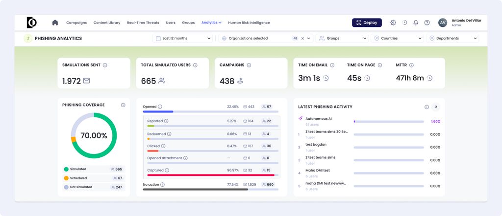
Phishing Analytics shows how your users respond to phishing simulations, with the underlying activity behind every number so you can verify it. Use it to track trends for click and report rates, check simulation coverage, and find the users who need follow-up.
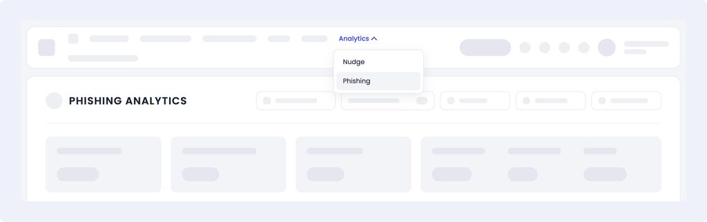
Access Phishing Analytics
Go to Analytics > Phishing Analytics. Nudge Analytics has moved to the same menu, under Analytics > Nudge Analytics.
Filter the data
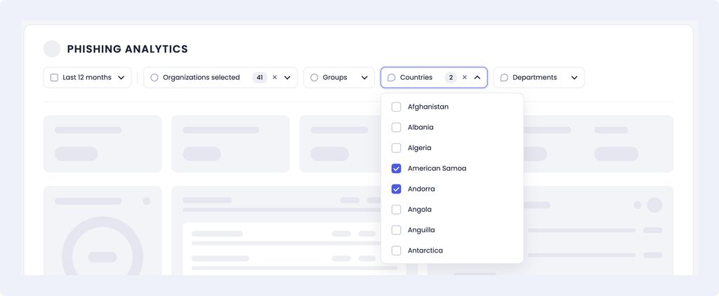
Use the filters to choose which users to include:
- Organizations
- Groups
- Countries
- Departments
Filters combine: a user is included only if they match every filter you select. Use the time range selector to change the period.
Summary Metrics

| Metric | What it shows |
|---|---|
| Simulations sent | Total number of simulation emails sent to the selected users |
| Simulated users | Number of unique users who received at least one simulation in the chosen range. |
| Campaigns | Number of unique campaigns the simulations came from |
| Time on email | Average time users spent on the simulation email |
| Time on page | Average time users spent on the simulation landing page |
| MTTR | Average time between a simulated phishing email being delivered and it being reported, for emails matching the selected filters. |
Hover over a rate to see how it’s calculated.

Dashboard widgets
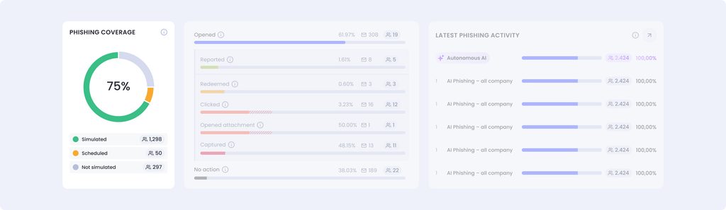
- Phishing coverage: how many of your active users have been simulated in the selected period, how many have a simulation scheduled, and how many have not been simulated. A user can be both simulated and scheduled, so these numbers may not add up to your total users. Deleted users are not counted here.
- Simulations Funnel: Rates are calculated per simulation email, not per user. For example, a card may show 500 opened emails from 70 unique users; the open rate is based on the 500 emails. Each status shows emails and users on separate cards so you can see both.
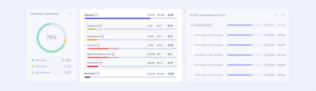
Each status counts every simulation that reached it, regardless of what happened next. For example, if a user opened a simulation email, then clicked the link and entered their credentials, that simulation counts as opened, clicked and credentials captured. Because a simulation can appear in several statuses, the cards aren’t meant to add up.
Each rate uses the simulations where that action was possible:
| Rate | Based on |
|---|---|
| Click rate | Click and credential capture simulations |
| Credential capture rate | Credential capture simulations only |
| Attachment rate | Attachment simulations only |
| Open and report rates | Across all types of simulations |
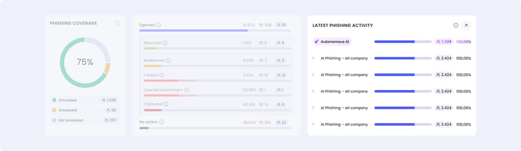
Latest Phishing Activity
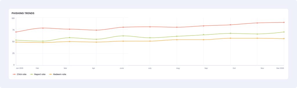
- Phishing Trends: click, report and other rates over time. Periods with no simulations sent are left blank instead of showing 0%.Phishing Trends: click, report and other rates over time. Periods with no simulations sent are left blank instead of showing 0%.
Note: Each point on the trend is based on the simulations sent in that period, so points aren’t comparable by volume. A 100% click rate could come from a single simulation email, while a 10% click rate could come from 100. Before drawing conclusions from a spike or a drop, check how many simulations were sent in that period, for example by setting the same time range and reviewing the activity table.
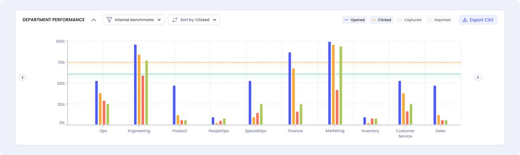
Department Performance: results broken down by department.
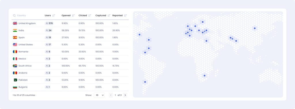
- Country Performance: Visual plotting of the countries the simulated users belonged to, with open, click, capture & report %.
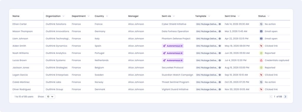
Activity table
The activity table is a chronological log of every phishing simulation sent to the users who match your organization, group, country and department filters in the selected time range. It includes simulations from both campaigns and autonomous AI phishing, as well as simulations sent to users who have since been deleted. Think of it as the platform’s phishing sent box.
The activity table lists every simulation email behind the numbers on the page. You can:
- Preview the template each user received.
- Filter by status, such as clicked or opened attachment.
- Export to CSV, with the same columns shown on screen, for further analysis outside the platform.
Act on the results
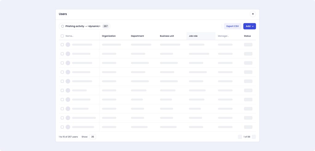
In widgets that show a user count, select the count to see the list of unique users behind it. From that list you can:
- Create a new group with the selected users.
- Add them to an existing group, for example to target follow-up training.
- Export the list to CSV.