OutThink offers insights into the distribution of security risk across your company’s employees. We try to answer the following questions:
- Who are your high-risk employees?
- Why are they high-risk?
- What can be done to mitigate risk?
- How do employees perceive risk and security?
WHO ARE THE HIGH-RISK EMPLOYEES?
The Human Risk dashboard provides a high-level view of risk across your organisation. It visualises the average risk score for all your employees, and the distribution of risk across employees and countries.


Further insights become available when integrations are implemented. Your customer success manager can talk you through your integration options.
WHY ARE THEY IDENTIFIED AS HIGH-RISK?
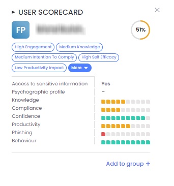
OutThink calculates a risk score for each employee. This is shown in the User risk score card.
The score card breaks the employee’s overall score into the components we use to calculate it. These components identify the specific attitudes and behaviours that make an employee high- or low-risk. The picture is filled in with further Insights.
The card also displays the employee’s current involvement in training campaigns. For more details on the User risk score card, please click here.

This user scorecard can be viewed by clicking on a specific user in the “User Risk Map” (to the right of the dashboard), or by clicking a user name in the bottom table.
HOW IS MY RISK DISTIRBUTED ACROSS THE ORGANIZATION?
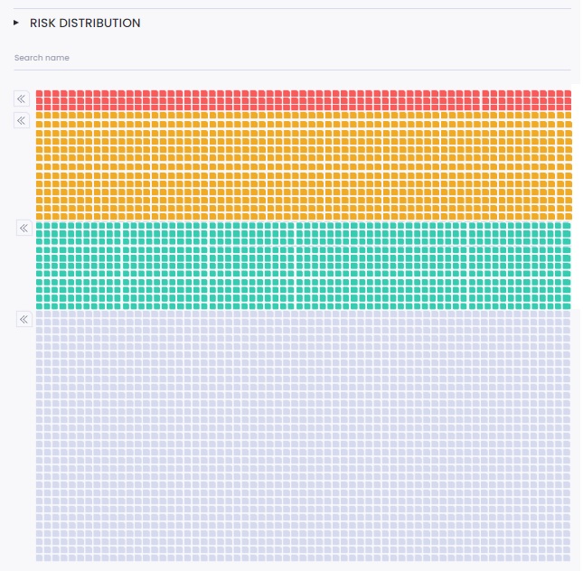
The Human Risk Intelligence dashboard groups users into three risk categories:
- Low
- Mid
- High
These categories are represented in a User Risk Map, for easy visualisation and exploration of risk:

The three colours correspond to the appropriate risk level:
- Red: high risk
- Amber: medium risk
- Green: low risk
- Gray: no risk score
When you click on a risk category, the corresponding filter is applied to the user table below, so you can see your risky users in a tabular view for extraction or further analysis.
WHAT INSIGHTS CAN I GET FROM MY USERS’ DATA?

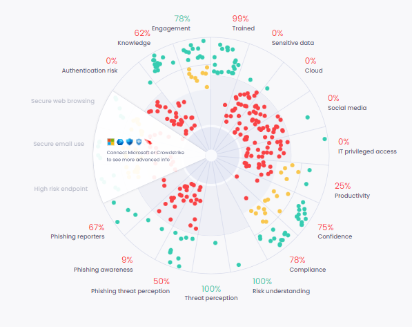
There is no one ideal approach to mitigating risk which fits every case. The Insights wheelchart provides the intelligence you need to customise mitigating action to the specific risk factors that affect your organization.
The centerpiece chart is populated with data points representing either single users or a group of users (depending on the user count in the tenant). The dots are distributed according to metric-value across each metric named on the circumference of the chart. Users (or user groups) are displayed as red, amber or green according to their level of risk in each metric.
The more red dots, the higher the level of risk. For ease of visualisation, riskier users are displayed at the centre of the chart, and less risky users at the edge. Segments with dense red dots are those where corrective action is most needed. If corrective action is effective, users will turn green over time.
Clicking on any of the sections shown on this chart generates a list of employees in the table below whose performance in that metric is concerning. Please click here to learn more.
HOW CAN I FILTER MY USERS FURTHER?

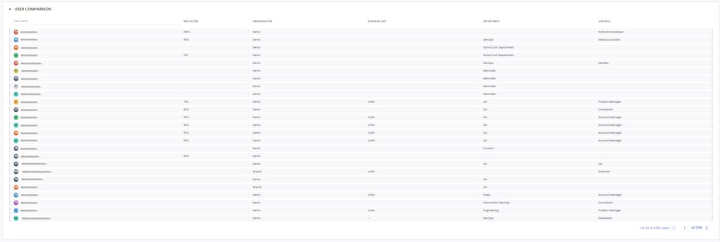
Whatever filtering is done in the above sections of the dashboard, this table reflects the user data at a granular level in tabular format.
It exposes the risk score of each user as well as personal information such as org/business unit/department/job role.
This table can be used for:
- Exporting
- Reportability
- Data inspection
- Group creation for intelligent campaign segmentation