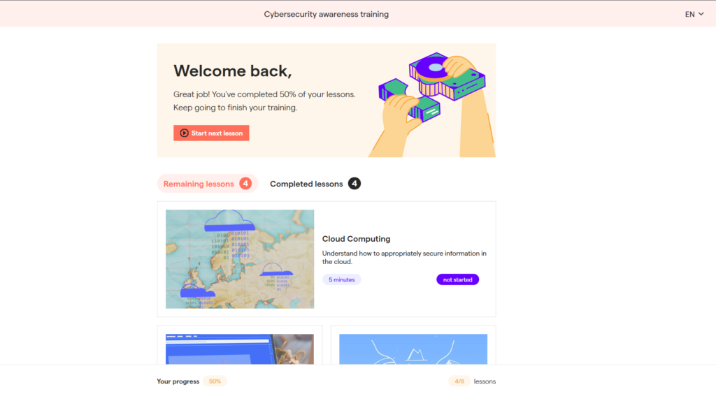
OutThink allows you to customise the visual style of the user dashboard. To customise this section, go to Settings -> Organisations settings – > Styles, and select Dashboard.

Here you can see the default appearance of the OutThink User Dashboard. In the steps below we’ll show you how you can change the style of the dashboard to suit brand guidelines. We’ve used an example set of guidelines you can find here.

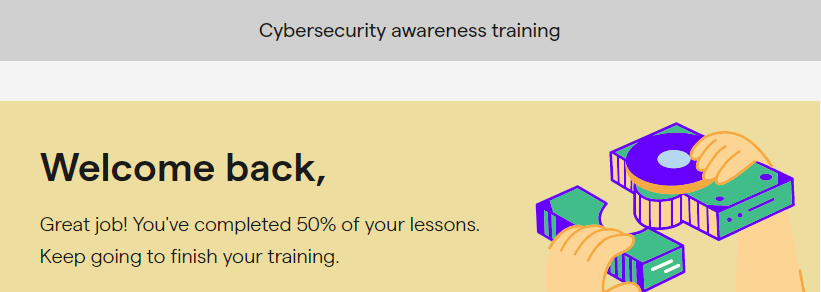
1. Changing the top bar colour. Edit the field Top bar. Below, we’ve set the colour to #d0d0d0.

2. Changing the main background colour. Edit the field Secondary. Below, we’ve set the colour to #f4f4f4.

3. Changing the start button colour. Edit the field Highlight 2. Below, we’ve set the colour to #d89a21.

4. Changing the button text colour. The colour of button text is determined by the Secondary field (see step 2 above).
5. Changing the button icon colour. Edit the field Button icon to change this colour. In the example below, it’s been set to #ffffff.

6. Changing main text colour. Edit the field Text to change the main text colour used throughout the dashboard. In the example below, it’s set to #1a1a1a.


7. Changing remaining/completed lessons bubble highlight colour. Edit the Danger Background field. Below, we have set the colour to #e1b401, with 35% opacity. This field also determines the active section highlight colours.


8. Changing the remaining/completed lessons text colour. This can be done by editing the Highlight field. This field also determines the active section text colours. In the above example, the colour has been set to #e1b401.
9. Changing the lesson “not started” status colour. Edit the Highlight 4 field to make this change. Below we’ve set the colour to #55555.

10. Changing the lesson length bubble colour. Edit the Info Background field. Below, we’ve set it to #55555 with 35% opacity.
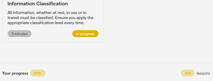
11. Changing the “in progress” bubble colour. Edit the Warning field. This field also determines the text colour in the “Your progress” bubble. Below, we’ve set this field to #e1b401.

11. Changing the completed status bubble colour. Edit the Success field to change this colour. Below it’s been set to #3abf87.

All done! Below you can see the dashboard with all the above customisations applied. If you need help customising your dashboard, don’t hesitate to contact your customer success manager.
Let’s move on to the next step: Customizing the Initial and Final assessments.
