OutThink gathers various data during the employee’s simulation experience. This data is used for both campaign statistics and employee-based risk analysis.
The campaign statistics are split into several sections.
SUMMARY SECTION

The data in this section offers a quick overview of the current campaign state. It aims to answer the following questions:
- What template was used?
- How many employees were engaged in the campaign?
- What is the performance percent in different action points:
- Opened emails.
- Clicked links.
- Compromised users (Credentials captured & Credentials captured but not placed).
- Average time to click.
- Average time on training page.
- Resiliency rate.
- Redemption rate (employees who report the simulation after being compromised).
- Median time to report.
- Activity timeline.
CAMPAIGN SEND PROGRESS

For large campaigns, track how many emails have been sent to users, and how many remain in the queue.
ADVANCED CLICK ANALYSIS
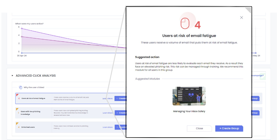
This section offers a unique take on attack simulation analysis (details here). The admin can gain insights into the question ‘why a user clicked’. Our attack simulation dashboards offer different reasons that may explain why a user got compromised. This empowers teams to take action beyond the traditional click rate.
To go beyond that, the same section offers an even deeper drill-down. A section that also provides the ability to answer the deeper question of ‘who are my riskiest users?’, since not all compromised users pose an equal threat. This section outlines insights that correlate different data points to surface the compromised users that present a higher risk to the organizations (administrators, C-suite executives, repeat clickers, etc).

Each surfaced insight from this analysis offers the possibility to identify who the users in question are by clicking on the card. It also allows understanding why they are being selected for that specific insight.

Furthermore, to allow admin teams to easily take action on this insights , the platform offers the ability to create groups of users on each of the insights, with an included suggested training action (by clicking ‘Learn More‘ on the card).

DEPARTMENT PERFORMANCE

This section allows administrators to analyze the best performing departments versus lower performing departments, and compare them against internal or industry benchmarks.
LOCATION PERFORMANCE

This section allows administrators to visualize the best performing locations versus lower performing locations and compare them against internal or industry benchmarks.
USER PERORMANCE

The data in this section provides detailed individual performance information for each employee. It allows administrators to see:
- Which template did the user receive?
- What was the end action of the user?
- What was the employee’s email sent time, click time, reported time, spent time on training page?
- Are you seeing false clicks in your data?
All data regarding the users performance can be exported to CSV and later manipulated in Excel, PowerBI, Tableu or other software.
By clicking on the record of a user, you can view more information about their interaction with the phishing simulation:

Details include the timestamps for open / click events, the user agent, IP addresses, operating system, browser and device associated with any click. This detail can help you analyze if there may be false positive clicks, and what could be causing them.
FEEDBACK ENABLED DATA
In cases where administrators enabled user feedback on landing page for the campaign, there will be additional charts representing the gathered information. They answer the following questions:
- How many users gave feedback on the landing page questions?
- What is the distribution of the answers?
- What did the employees share as direct text feedback?
